Collectif Courrège Logo
Even though the stakes might seem low, we approach every project with absolute professionalism.
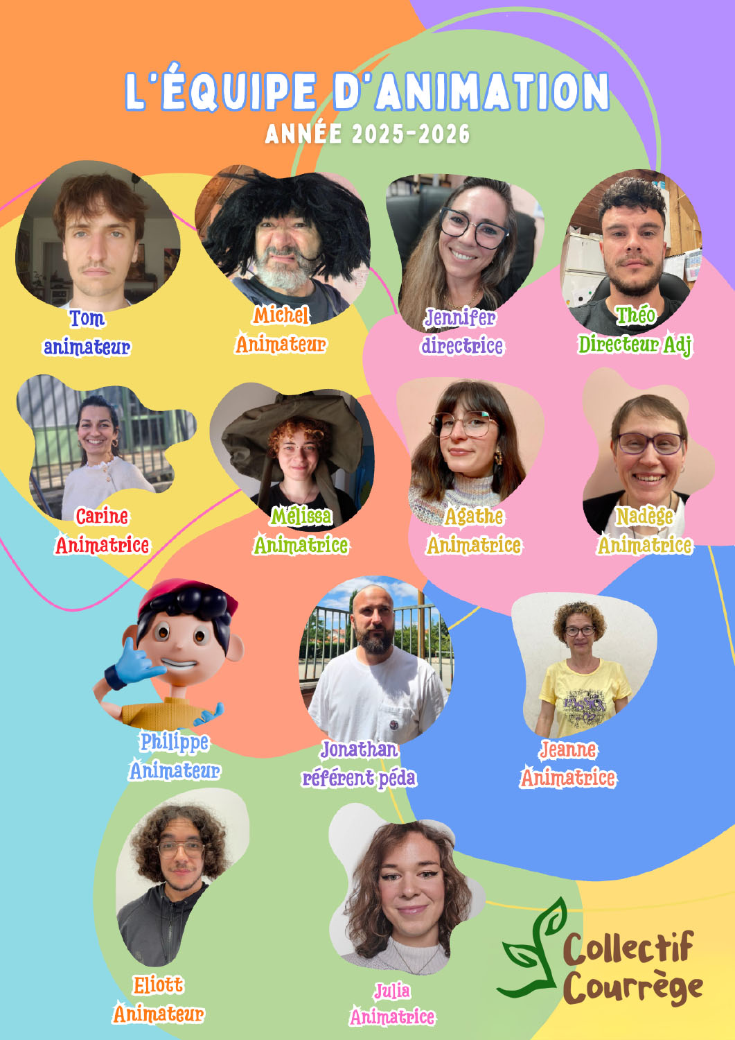
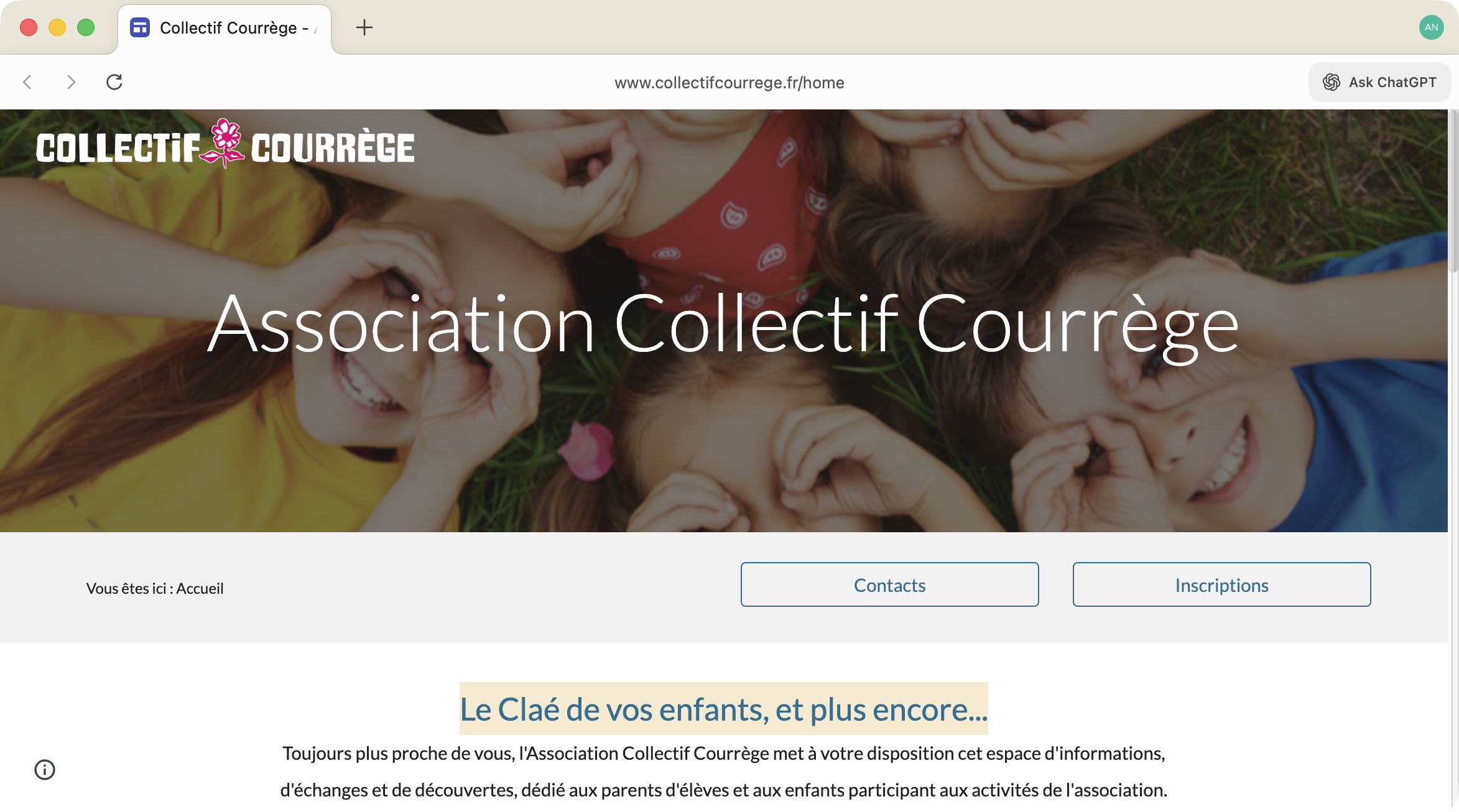
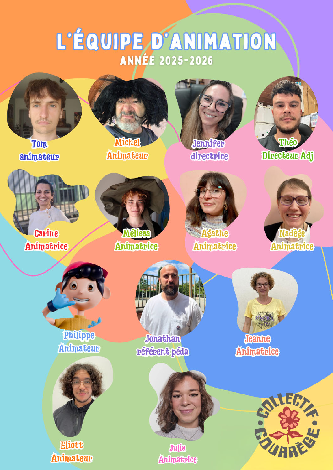
The after-school program for the local elementary school was looking for a new logo, so we created three candidates.
For a kids' program, we were looking for something that was fun and inspired confidence.
The biggest challenge was balancing the appeal factor for children ("imp" version) against the more security-conscious parents
In designing a logo, it's always important to see how it works in context — it's all too easy to create a cool mark that just doesn't work at small sizes, or won't fit in a website.
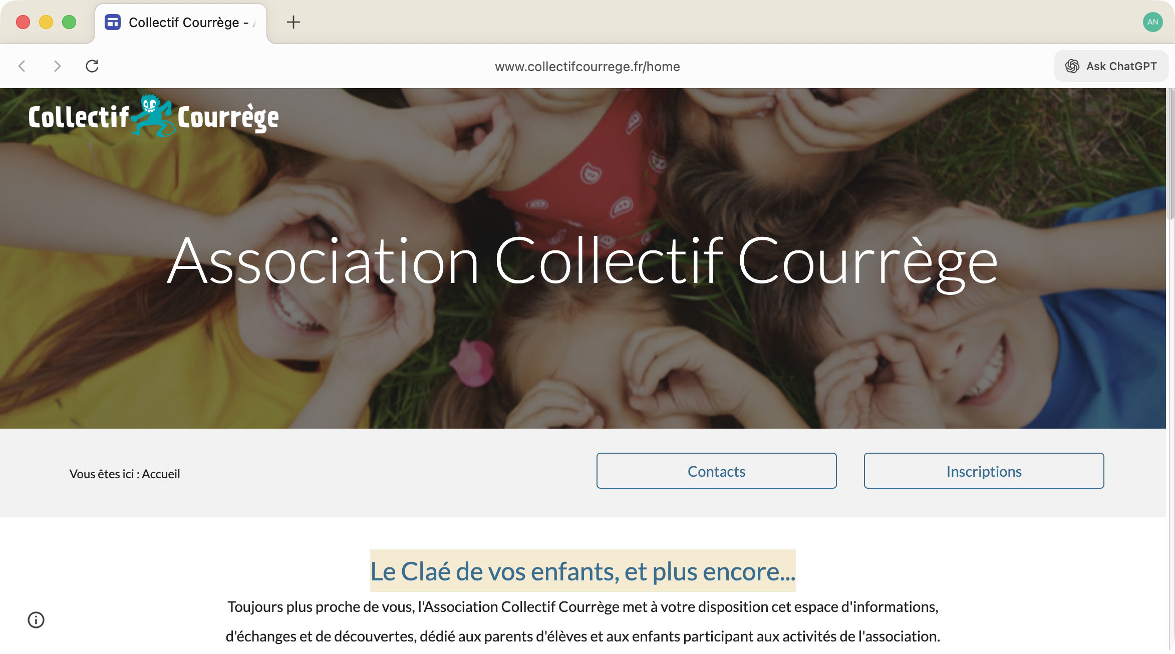
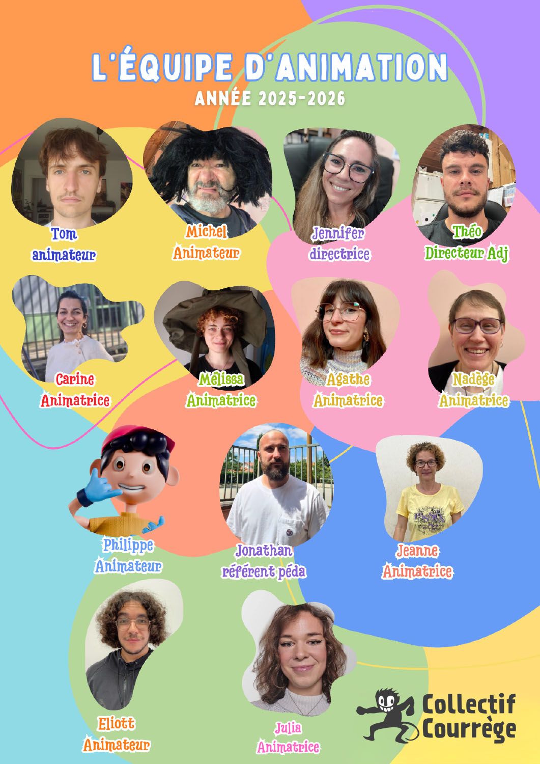
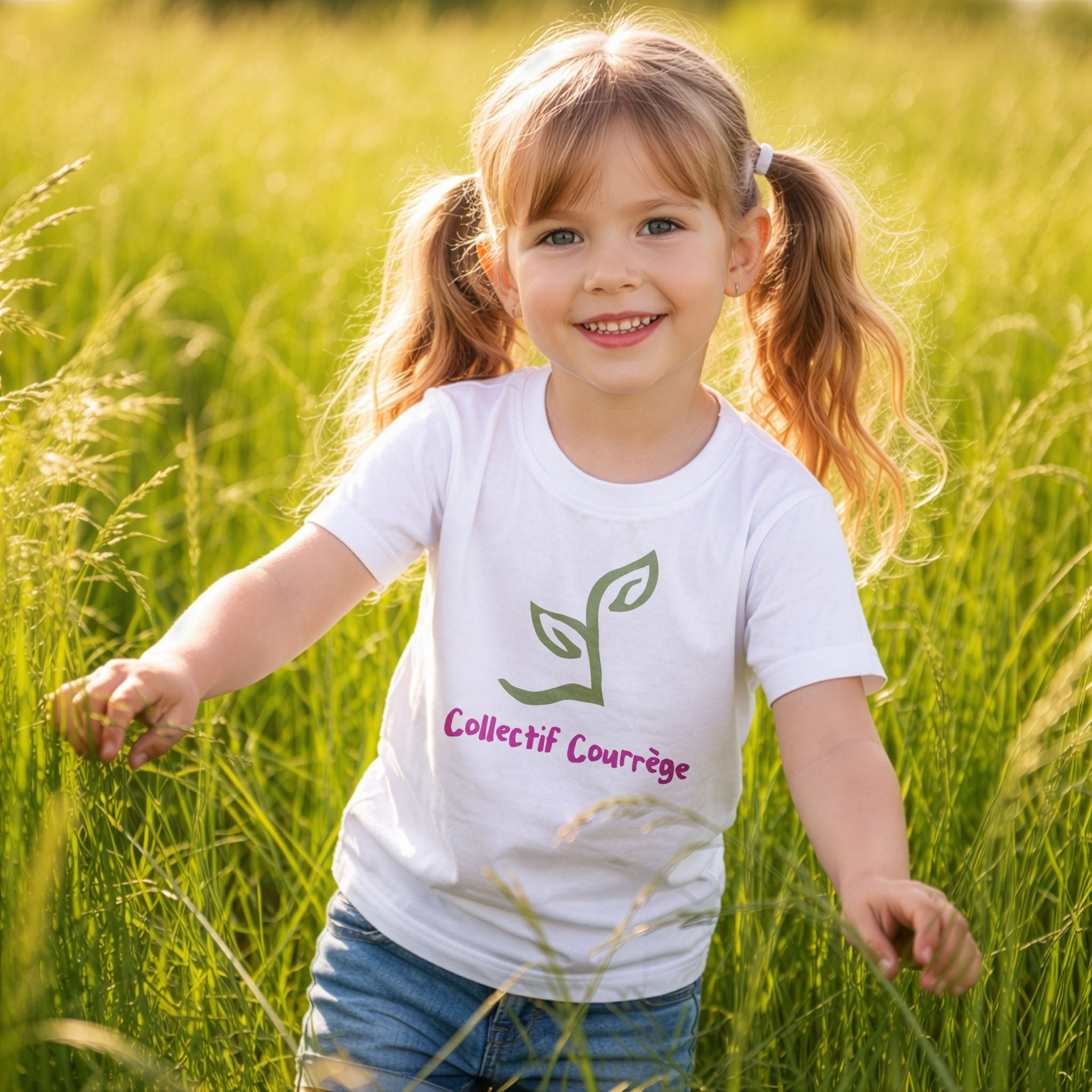
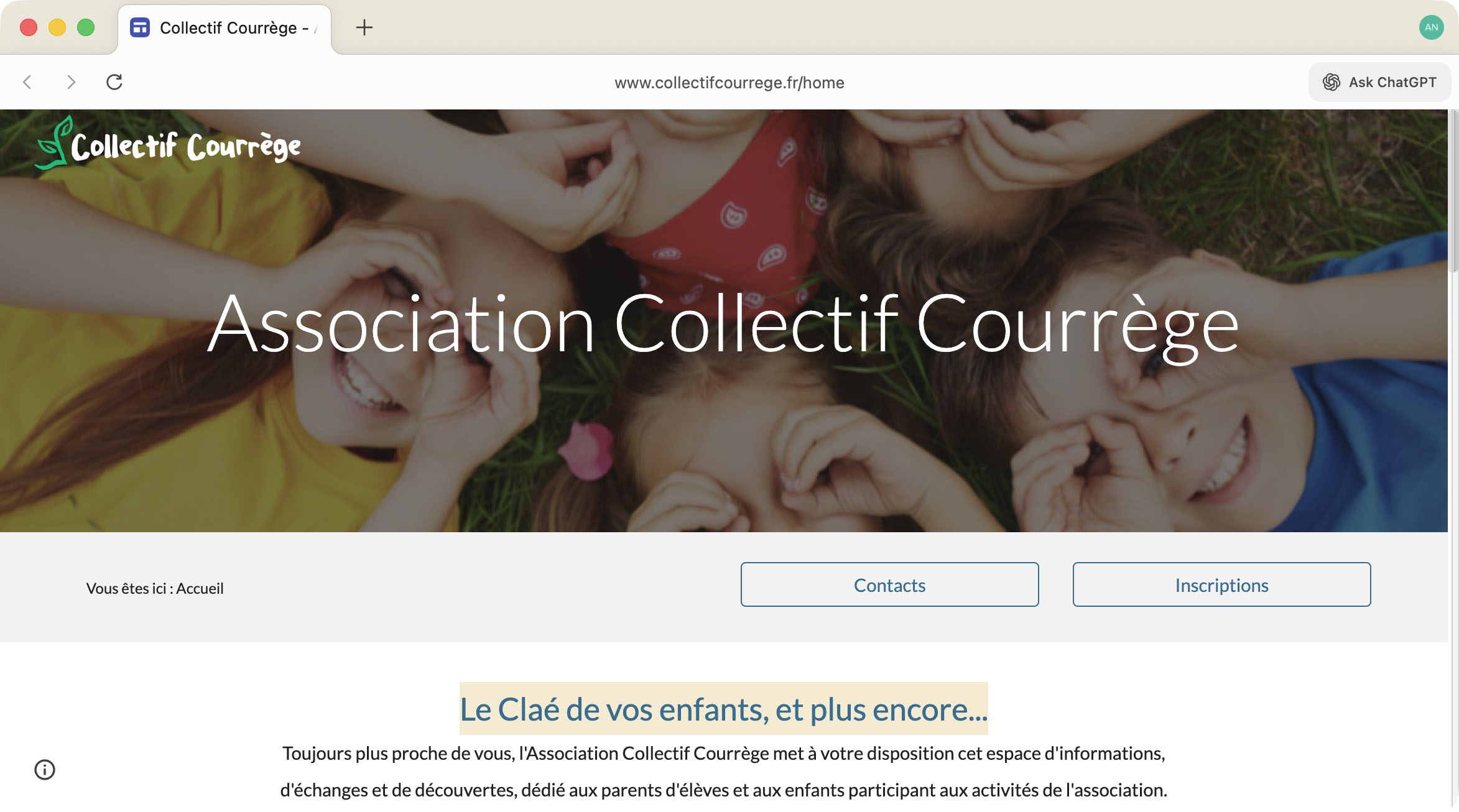
For each logo, we provide a version on a t-shirt, the website and on a poster.
The Leaf — safe and ecology-friendly
The logo is simple yet original. The off-axis presentation creates interest in a design that could have fallen into a cliché.
The Flower — expression and growth
The logo is graphic yet questioning. Putting the text in a circle creates a pleasing label effect that works well on a poster, the most common use case.

The Imp — playful and fun
The imp was far and away the most popular choice among children. After school is for playing!.
The log is distinct and manages to convey a hint of misbehavior (pleasing to children) in a cute messinger (pleasing to parents).